Levi's Mobile App
Levi’s Mobile App
My role: I led native app design for Levi’s in the US and EU, a $40M business in annual revenue. I’m extremely proud of my design accomplishments at Levi’s because I closely track e-commerce metrics, and in 2023 I helped US app revenue top $20M, an increase of 22% or $3.6M. In the EU, I helped grow app revenue to $19M, an increase of 49% or $6.5M.
These are historic numbers for Levi’s, their online business, and the Levi’s mobile app specifically. In 2023, I helped make the US app 10% of all online revenue and the EU app 20% of all online revenue. Both figures are up significantly year over year.
Navigation Redesign
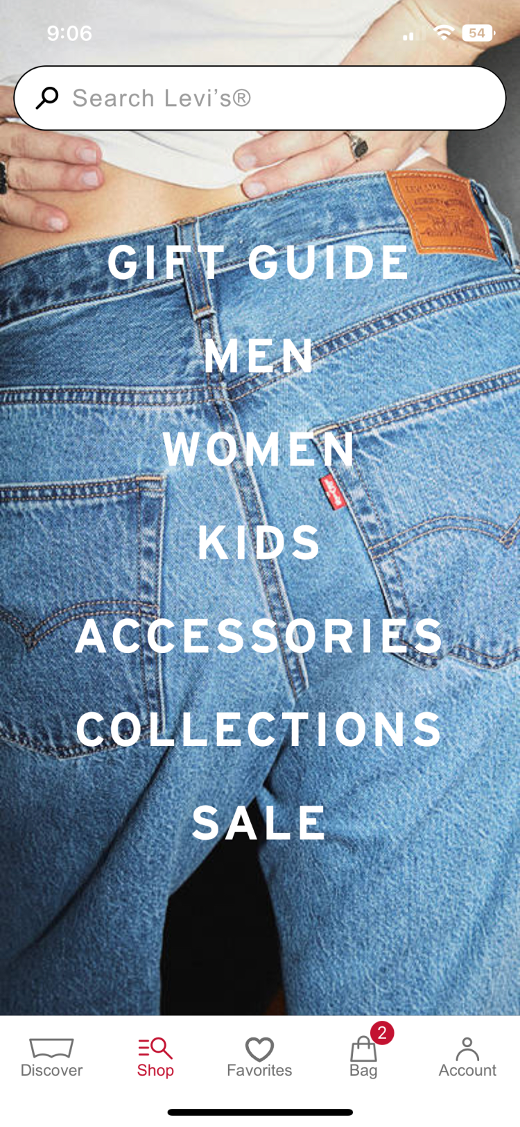
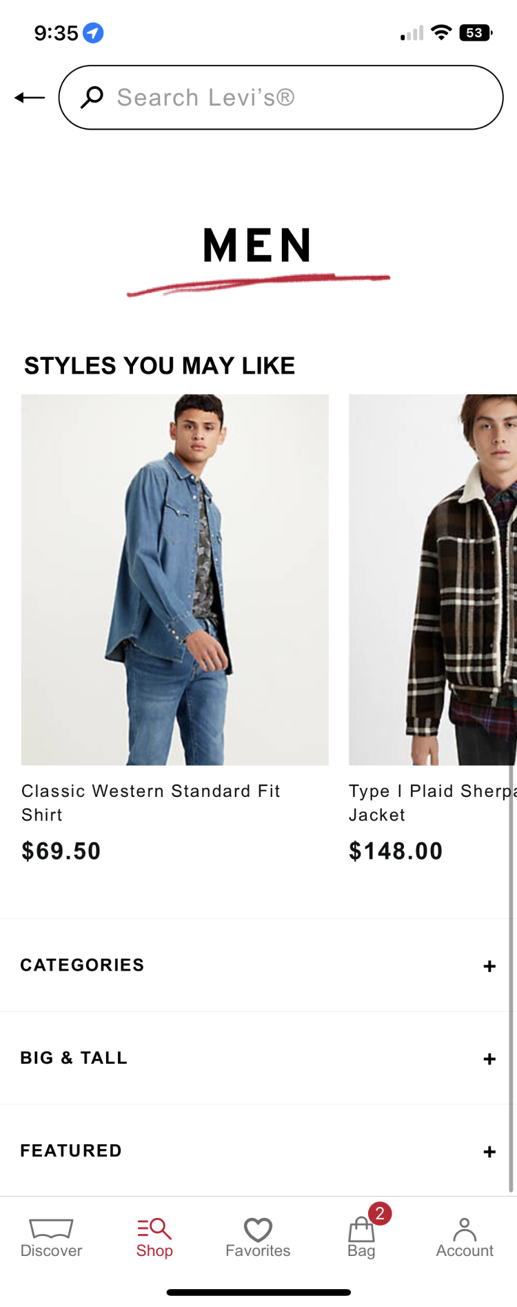
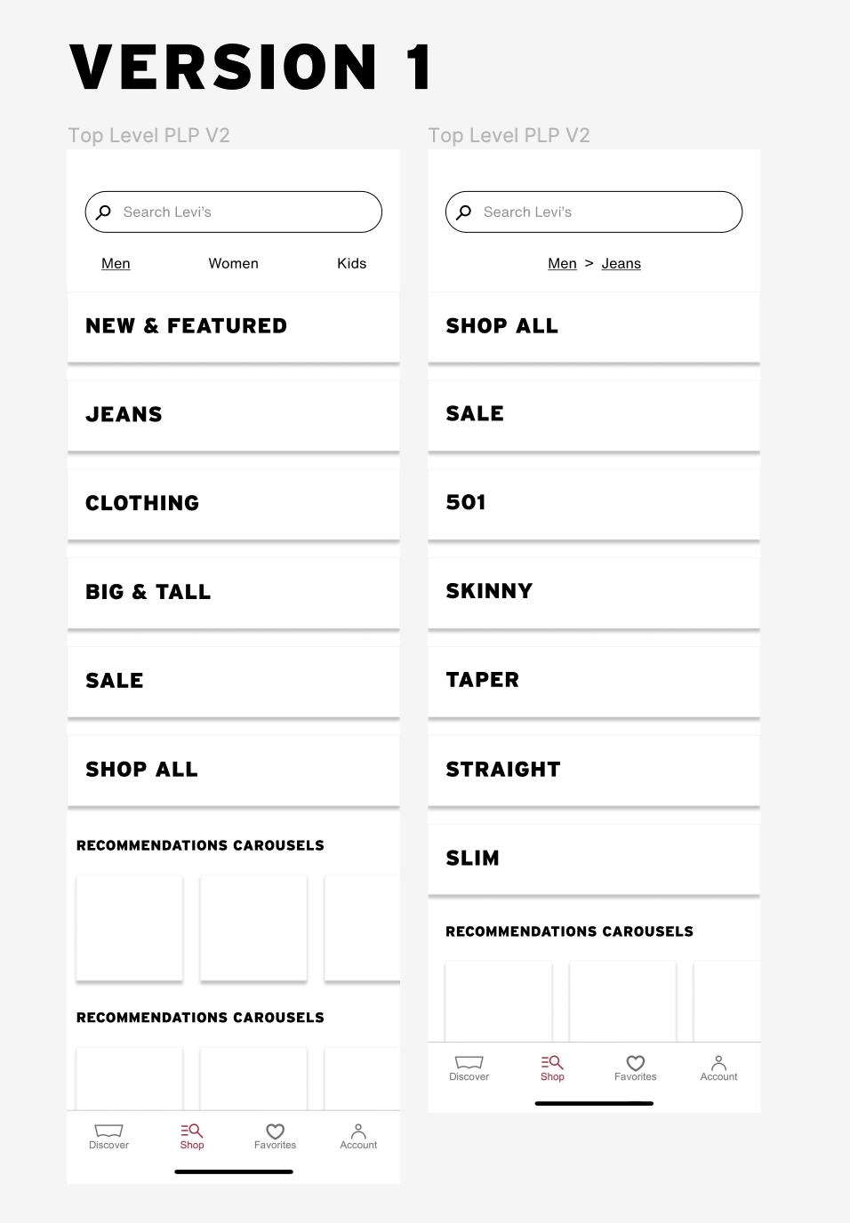
Problem: Customer satisfaction data pointed to app navigation as a significant area of opportunity, with comparatively and historically low figures. In direct user feedback from qualitative research, users struggled to find categories and products they were interested in. This was because of UI problems with the existing app navigation.
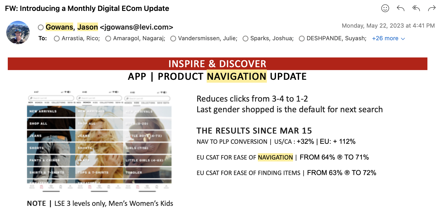
Solution: I led a redesign of the Levi’s mobile app navigation. The project success was the result of identifying a significant user problem through analysis of existing user research, qualitatively validating early solution ideation, and closely tracking clear quantitative metrics. Upon implementation, the navigation redesign yielded fantastic results:
Revenue: Directly attributable increase in mobile app annual revenue by $900k in EU and $500k in USA.
Conversion: Improved get to product success rate, the percentage of users who convert to the product list page (PLP).
Up 112% in Europe, 32% in USA
CX: Improved customer satisfaction score (CSAT) for “ease of navigation” and “ease of finding items”.
CSAT for ease of navigation up 11%, from 64% to 71%
CSAT for ease of finding items up 14%, from 63% to 72%
Before Screens
Discovery
Working within our quad (design, product, research, engineering) while reviewing upcoming project priorities, we found CSAT data pointed to app navigation as a major area of opportunity. CSAT is gathered by a Qualtrics survey that triggers on the app at random points during the shopping experience. The survey asks for a 1-10 score on several key areas and then generates a percentage as an average of the responses. A higher percentage indicates more positive responses, a lower percentage indicates more negative responses.
For over a year, month after month, app navigation had scored worse than almost every other key area on the app. Nonetheless, there had been no attempts to improve navigation in several years. We decided to focus on the area of app navigation, confident we could find a problem underlying the poor CSAT numbers and devise a solution to improve qualitative feedback and thus quantative results.
Define
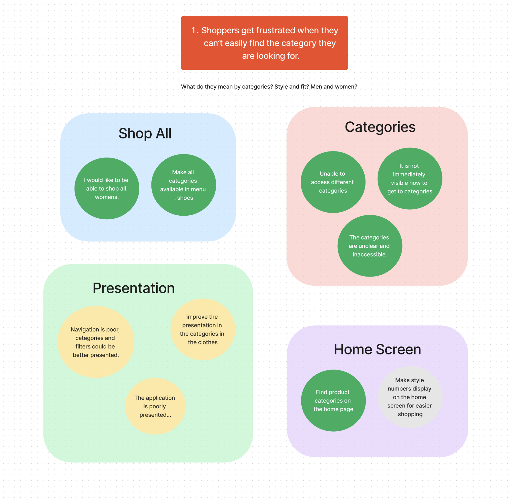
As I dug deeper into CSAT data through an affinity mapping exercise, I noticed that many raw user comments were related to issues finding categories and products. I also reviewed several internal user studies on related areas in the app and found similar user feedback. Finally I consulted Baymard best practices, an industry leading repository of distilled e-commerce recommendations, and found supportive findings.
Quantitative metrics also pointed in a similar direction. Users were engaging with navigation at a lower rate than search and recommendation carousels, something which I found was unusual compared to industry benchmarks and best practices.
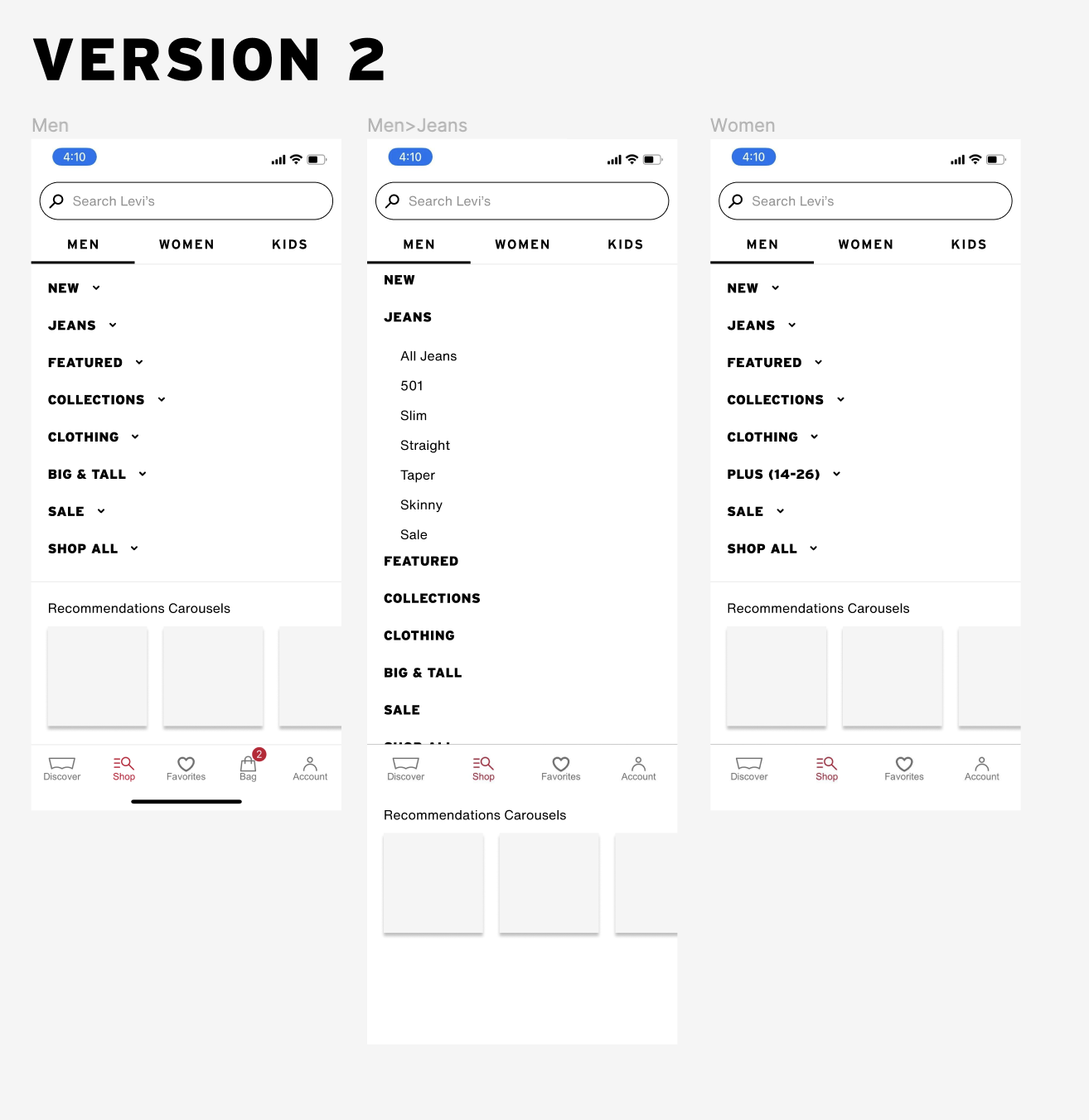
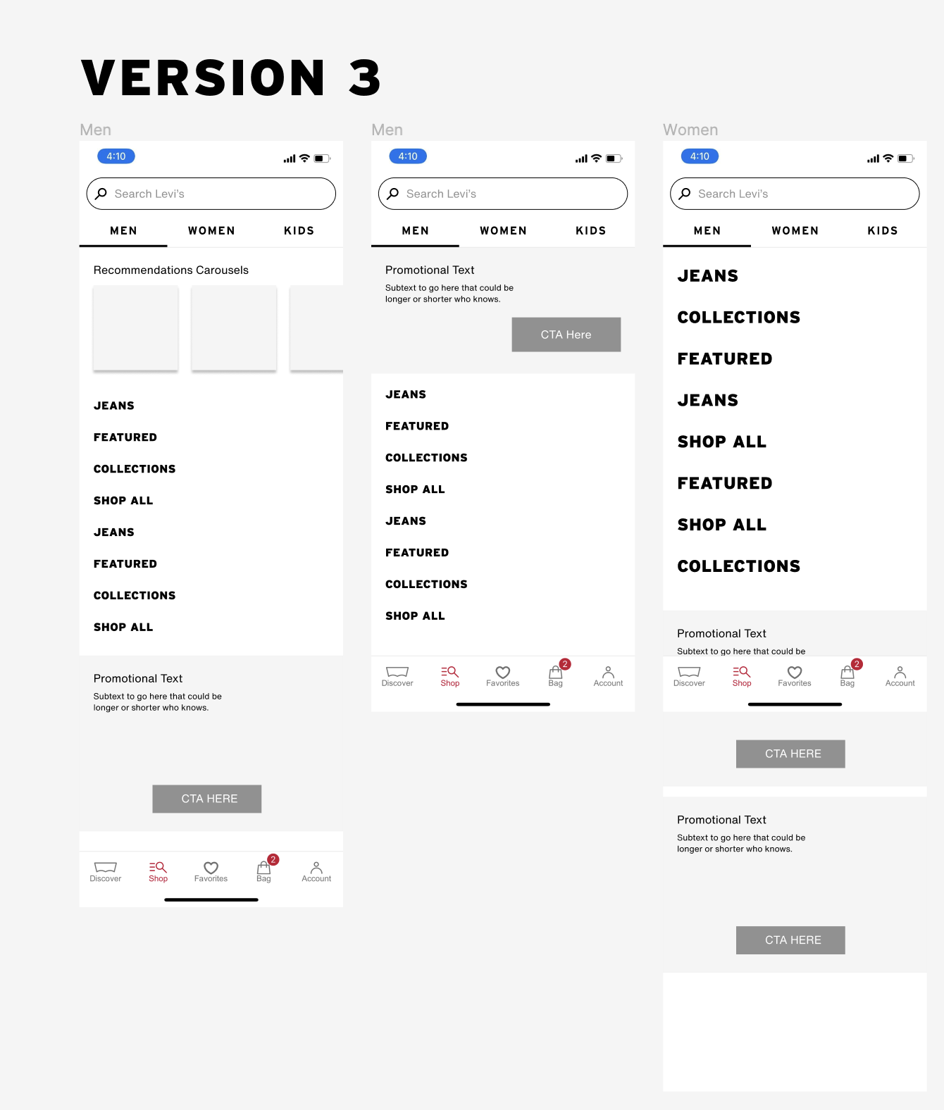
What I determined was that the main problem was that users could not quickly see categories they were interested in shopping. The flow and layout of the navigation was preventing users from understanding what products and categories were immediately available to them, or that might live under a specific category. While they were issues with our taxonomy, they were largely created by failures in our UI to adhere to best practices and user feedback.
Design
I worked on several early design iterations. I presented my discovery process and early designs to our working group, as well as at our weekly design feedback sessions in front of the entire design team. I iterated through several early ideas to finally come to a design that I was ready to put in front of users to gather feedback.
Validate
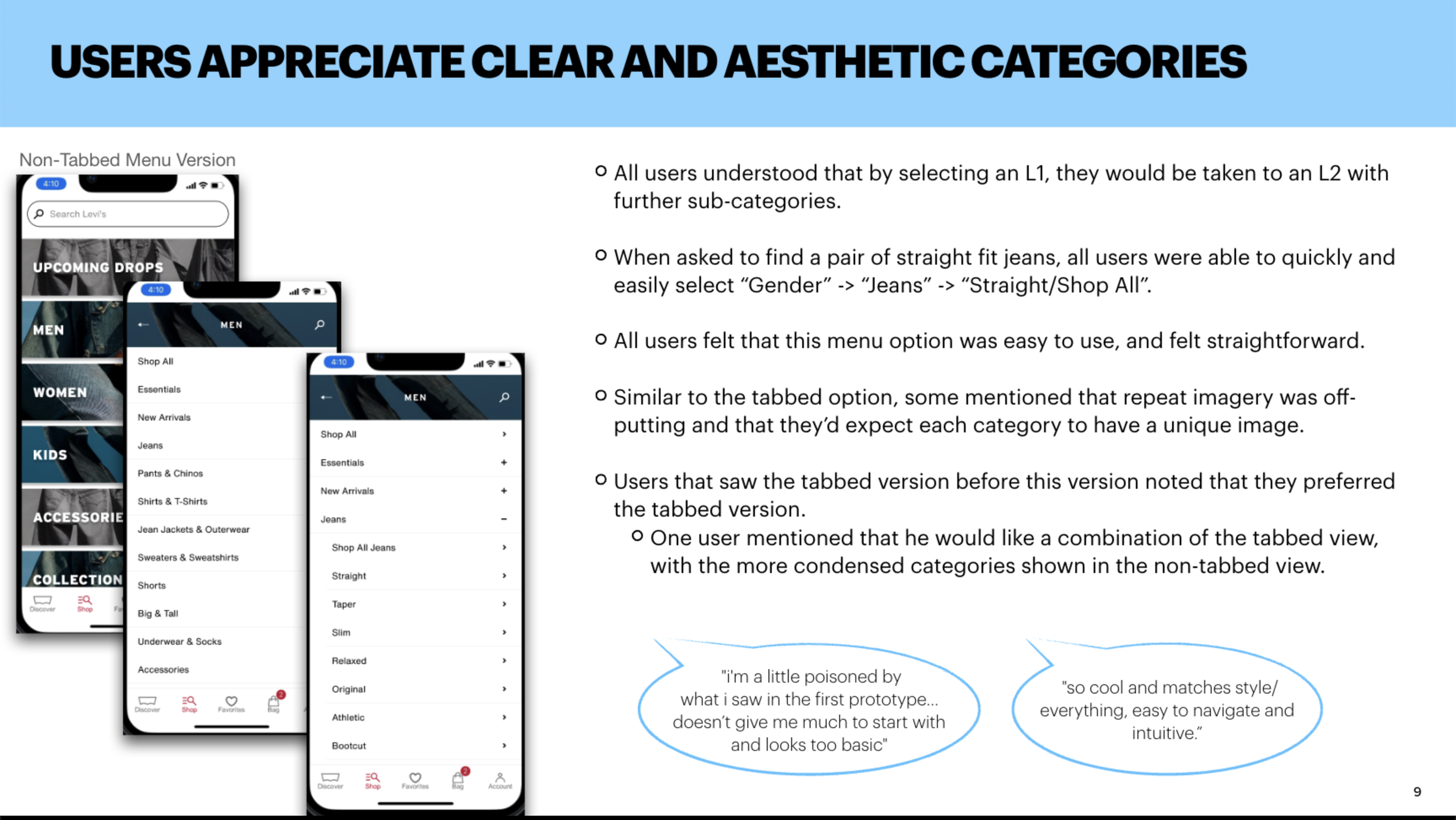
I wrote a user testing plan with help from our research and product team. I also lead research ops, spinning up our test environment in usertesting.com, crafting our audience filters, reviewing acceptance rates and launching tests. The sample was two groups of 10 unmoderated tests, 5 men, 5 women, with XYZ demographics. I also led analysis, reviewing test results and direct user feedback and crafting the spreadsheets that captured the qualitative data.
Our design performed positively and received almost unanimously positive feedback. We were confident that we had a good design, well thought out and well received.
Live Results
Results were phenominal. My project was highlighted by the VP of Digital in his monthly memo to the entire digital organization as a model for how we could achieve department wide goals.
More Of My Work @ Levi’s
Out of Stock Recommender
Shoppable PLP
Product Comparison Chart
